Kitchen Display System Redesign
Panasonic, 2025
Project Overview
Redesigned a configurable B2B kitchen display platform’s order flow, card system, and alert states, replacing a rigid, non-customizable interface with one restaurant brands could configure to their own layout, theme, and workflow.
The existing kitchen display system used a single fixed layout that couldn’t be adapted per restaurant, store, or workflow, which became a problem as the platform expanded to serve multiple brands with different card styles, color themes, and station setups. The interface was also dated and difficult for kitchen staff to parse quickly under pressure.
How might we give kitchen staff a display that surfaces urgency and order details instantly, while letting each restaurant brand configure it to fit their own kitchen?


My Role & Constraints
Work split: I owned everything above. My co-designer owned the login screen and the table (system) view.
Understanding the Problem
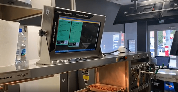
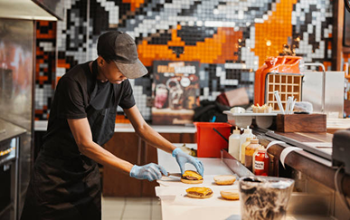
Every restaurant saw the same fixed layout, no matter their kitchen's needs.
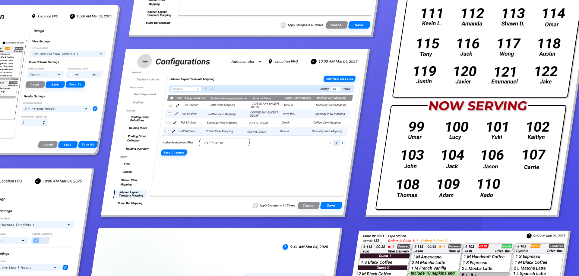
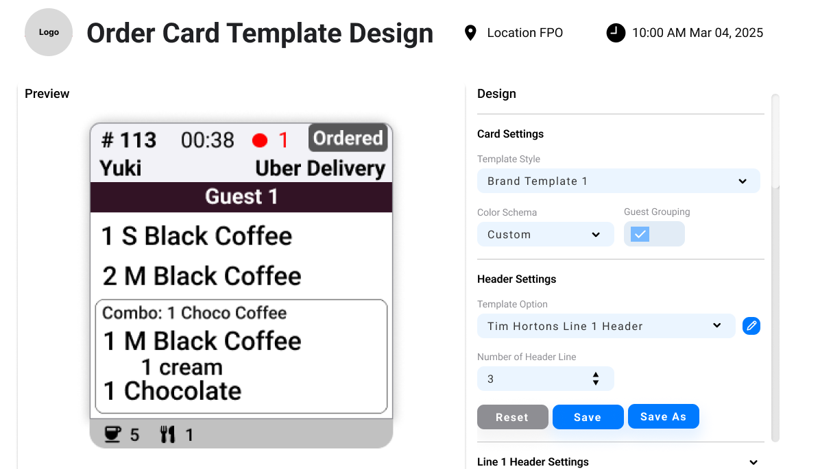
Designed a template configuration system letting admins set color scheme, logo, grid layout, card count, and header structure per brand, with a live preview.
Staff needed to spot urgency (new, rush, special instruction, running late) from across the kitchen.
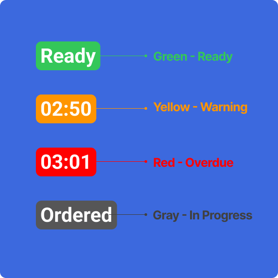
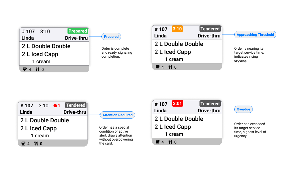
Designed distinct alert states using color and status badges rather than relying on text alone, so urgency reads instantly without close reading.
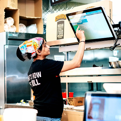
Readability came down to what appeared first, with a lot of information competing for one card.
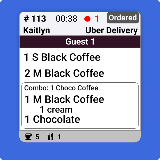
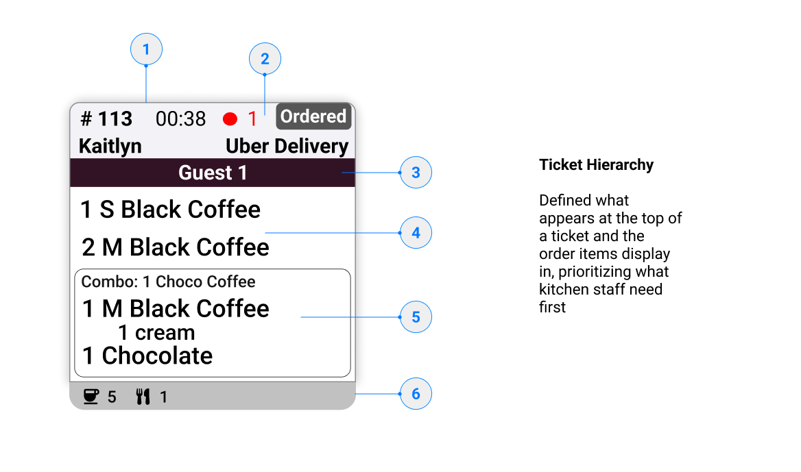
Made deliberate hierarchy calls on ticket structure: what sits at the top (order #, time, status), and what order items/modifiers appear in.
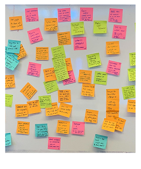
Research combined direct observation with staff interviews, since the biggest risks were things staff wouldn’t think to mention unprompted, like reading a display from six feet away with wet gloves on.
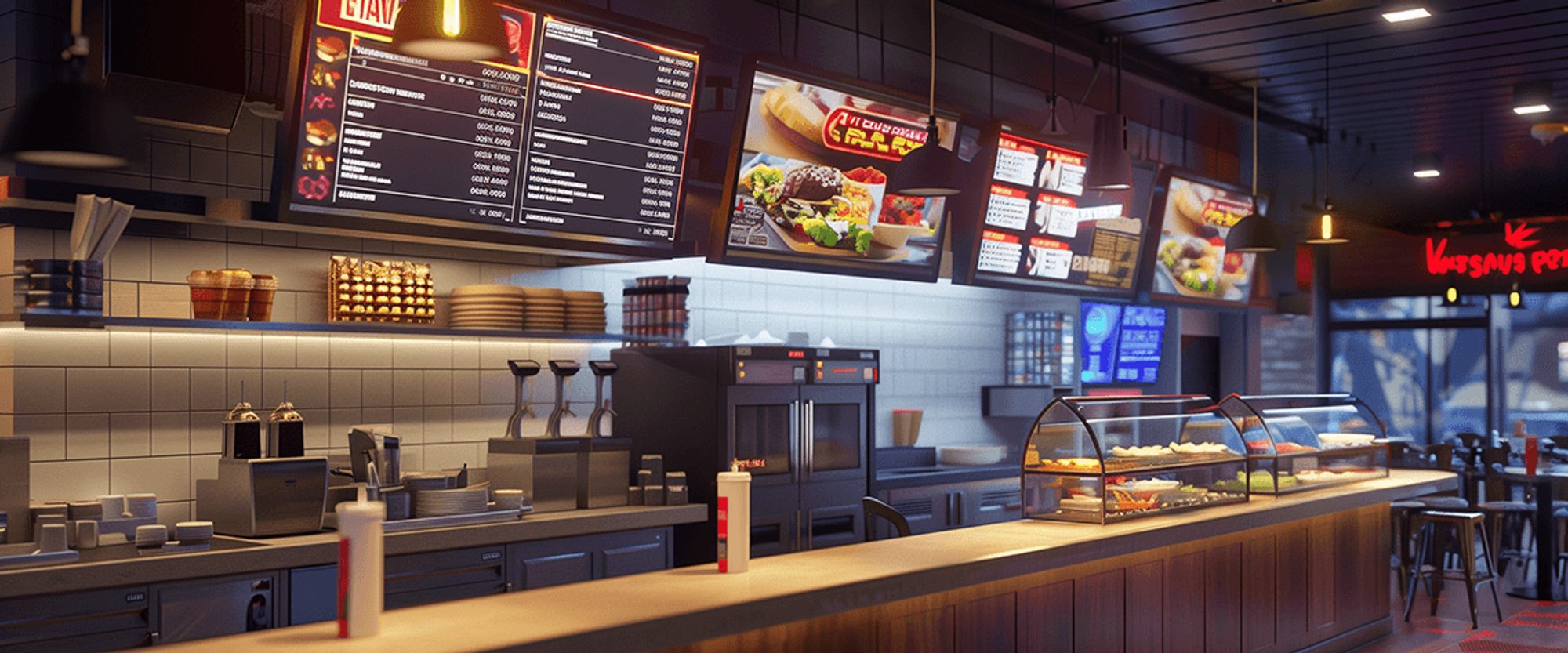
What we found
brands shadowed could customize layout, color, or branding on the old system.
Hover 4 notesrush tickets were caught late or missed entirely during shadowing sessions.
Hover 4 notesof tickets observed had modifier text that wrapped, cut off, or needed scrolling.
Hover 4 notesExploration & Key Decisions
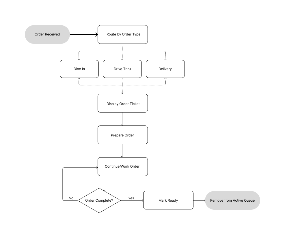
Flows and wireframes
Mapping how an order moves through the kitchen — from intake to handoff, plus the timer logic driving urgency — shaped the wireframes and card iterations that followed.

Iterations
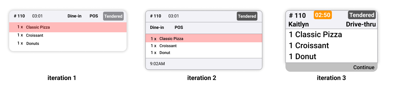
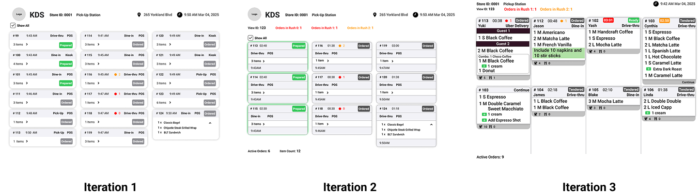
The ticket card and order board each went through several rounds, refining hierarchy, timers, and legibility from across a working kitchen. Early passes tried to surface every signal from the flow chart’s timer and priority logic directly on the card, then pared back to just what staff could read at a glance.
The Solution
Configurable card & view templates
Built a template system so admins can set color theme, logo, grid layout, card count, and header structure per restaurant brand, with a live preview before saving.
See the Screens
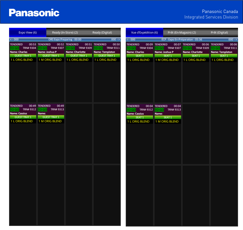
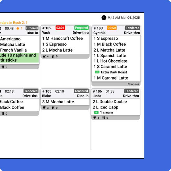
Below is the shipped kitchen display, screen by screen. I designed and built every view in this walkthrough myself: the order board, the ticket states, and the template configuration tool.