TFT Design: Mythweave
2026
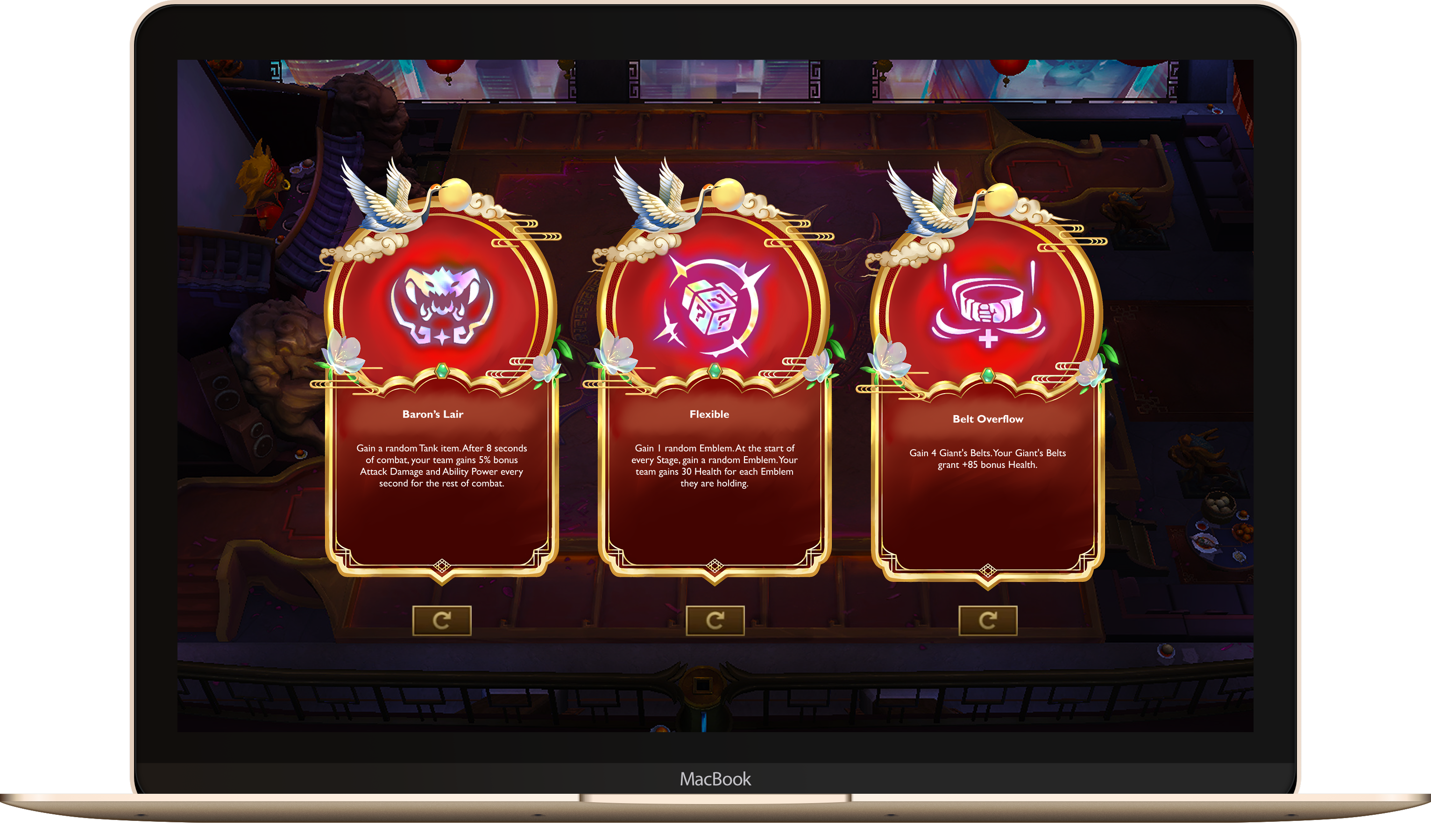
A speculative Teamfight Tactics set concept: a mythic card frame redesign for the game’s Augment system.
Project Overview
For this project, I designed a custom TFT augment card system for Mythweave, focusing on silhouette, hierarchy, material, and thematic detail. The goal was to create cards that feel native to TFT while introducing a distinct visual language inspired by traditional ornament, clouds, and ceremonial forms.
Visual Identity
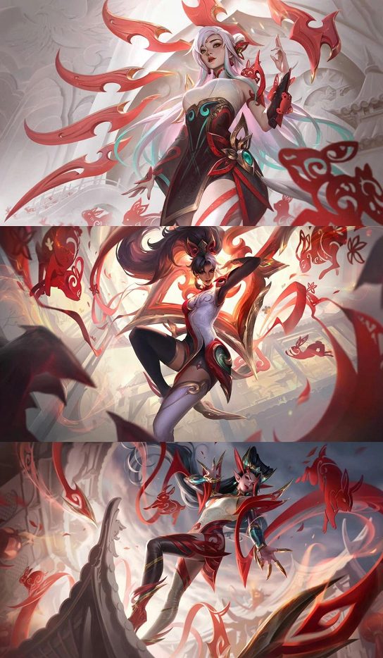
Mythweave’s look pulls from three of League’s mythic skin lines, each reinterpreting East Asian myth and ceremony through a different lens: Mythmaker’s folklore-costume energy, Shan Hai Scrolls’ bestiary elegance, and Immortal Journey’s spirit-warrior motion. Together they shaped the ornament, silhouette, and color language behind the card frame.
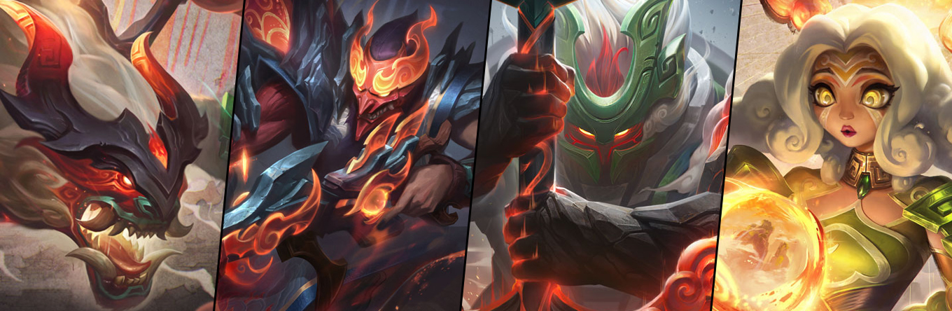
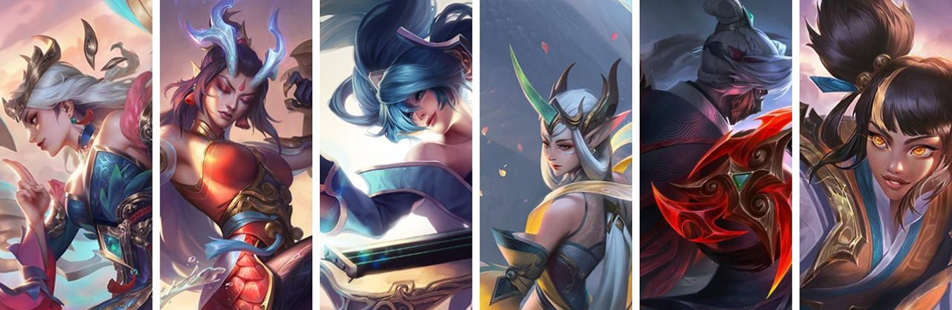
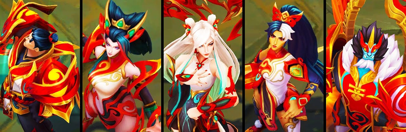
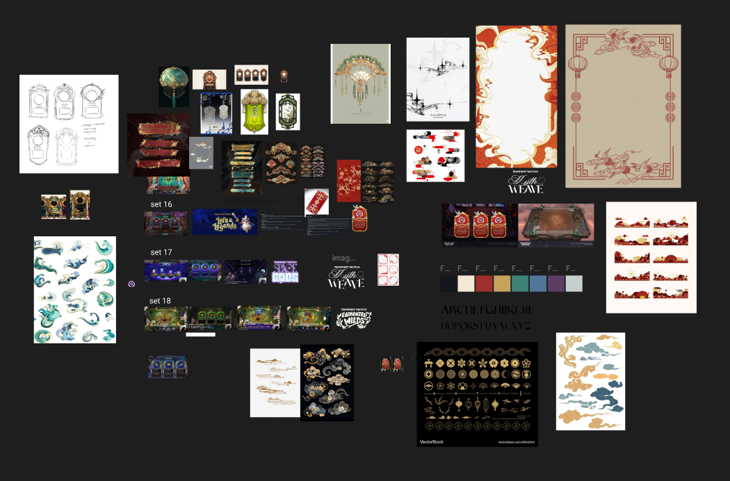
Before designing anything original, I pulled these references together into a single board of ornament patterns, past set art direction, and color studies, to work out what Mythweave should borrow and what it needed to do differently.
Auditing past sets
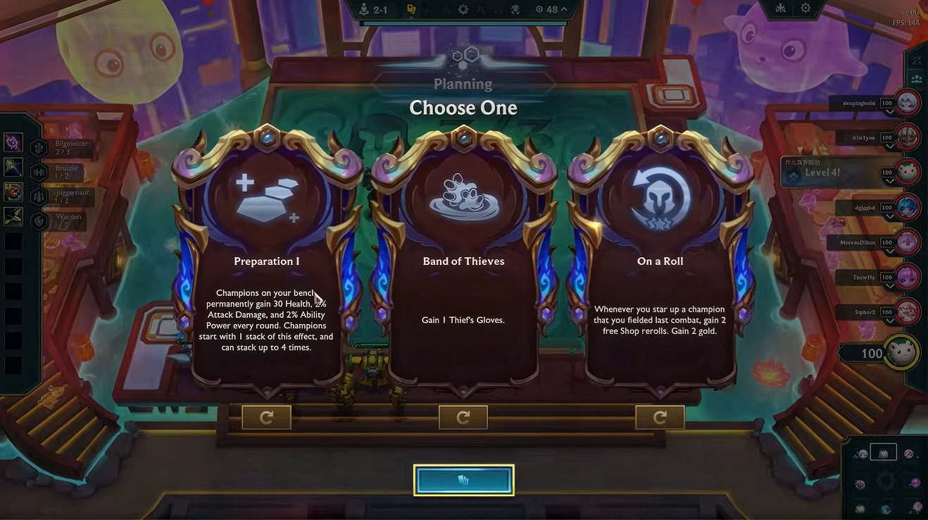
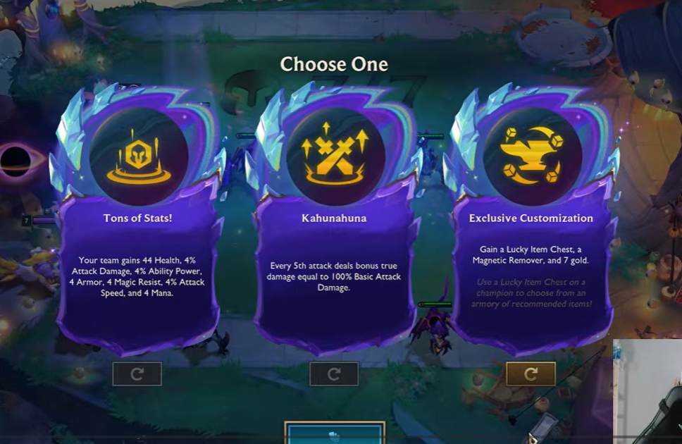
Before drawing anything, I pulled up how TFT had framed its augments across previous sets. The art direction is thrown out and rebuilt every set, so the frames share almost no ornament, palette, or silhouette with each other.
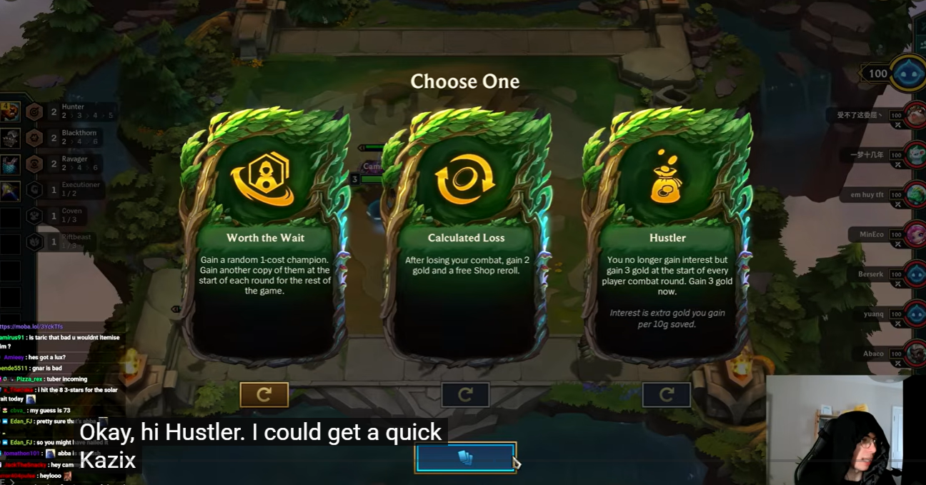
What stays constant
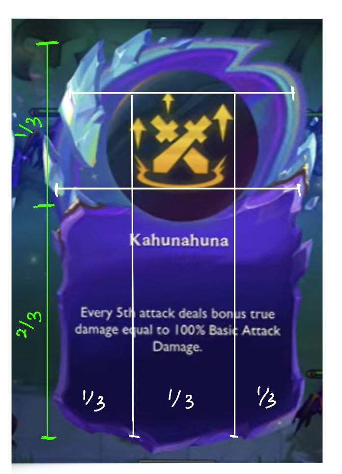
What does not change is the proportion. Measured against each other, every set puts the icon in the top third of the card and the text box in the bottom two thirds, and the icon sits across roughly half the card’s width.
That gave me the structure to design against: Mythweave could take its own ornament, palette, and silhouette as far as I wanted, as long as it hit those proportions and still read as a TFT augment at a glance.
Designing the Card Frame
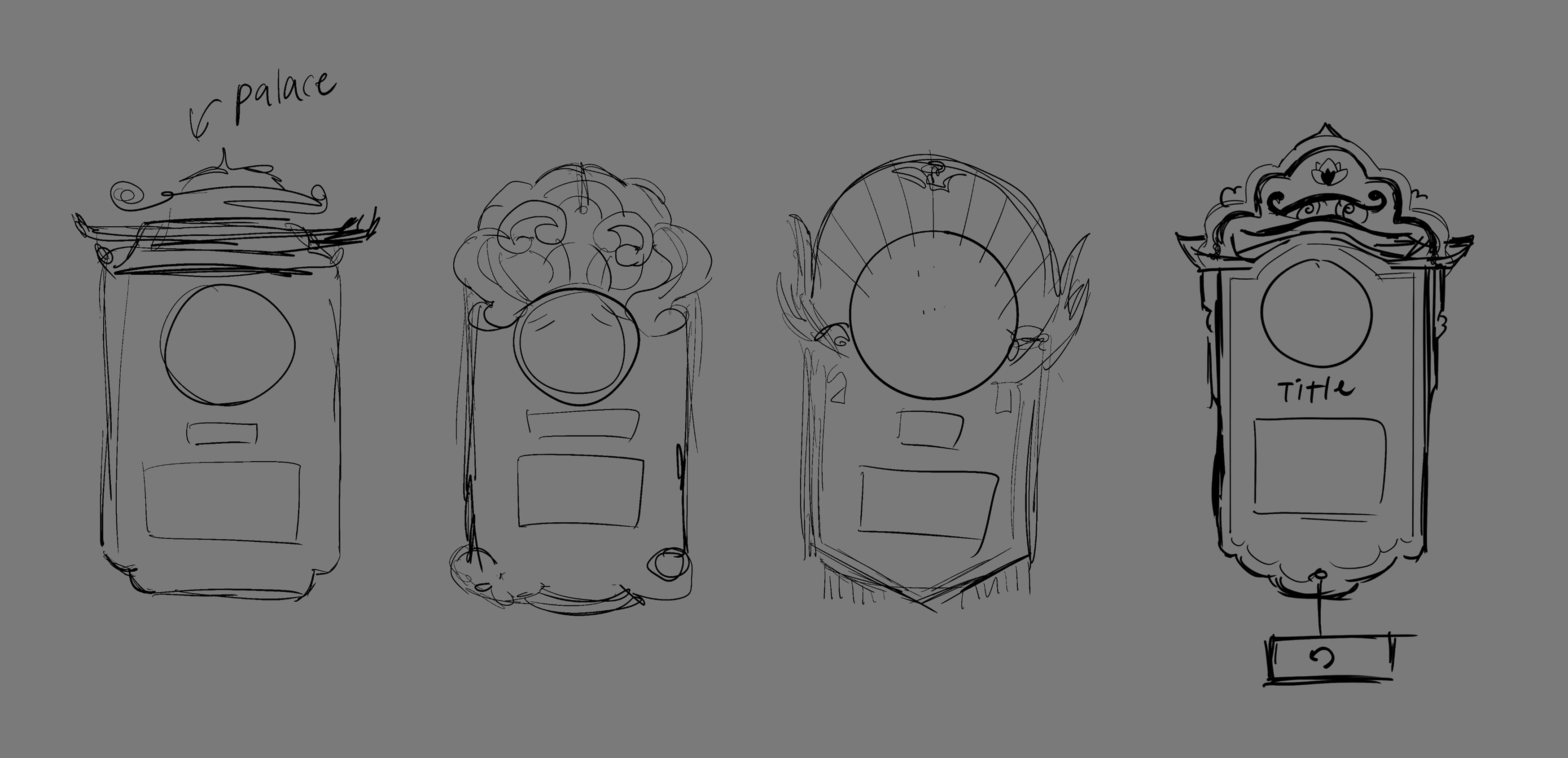
I started with quick thumbnails testing different crest silhouettes, from palace eaves to floral crowns to radiating fans, before narrowing toward a direction.
From there I iterated on the frame more systematically, weighing East Asian traditional, heavenly, and Victorian ornament against each other under the “Mythweave” theme, before landing on the crane-and-cloud crest that carried into the final frame.
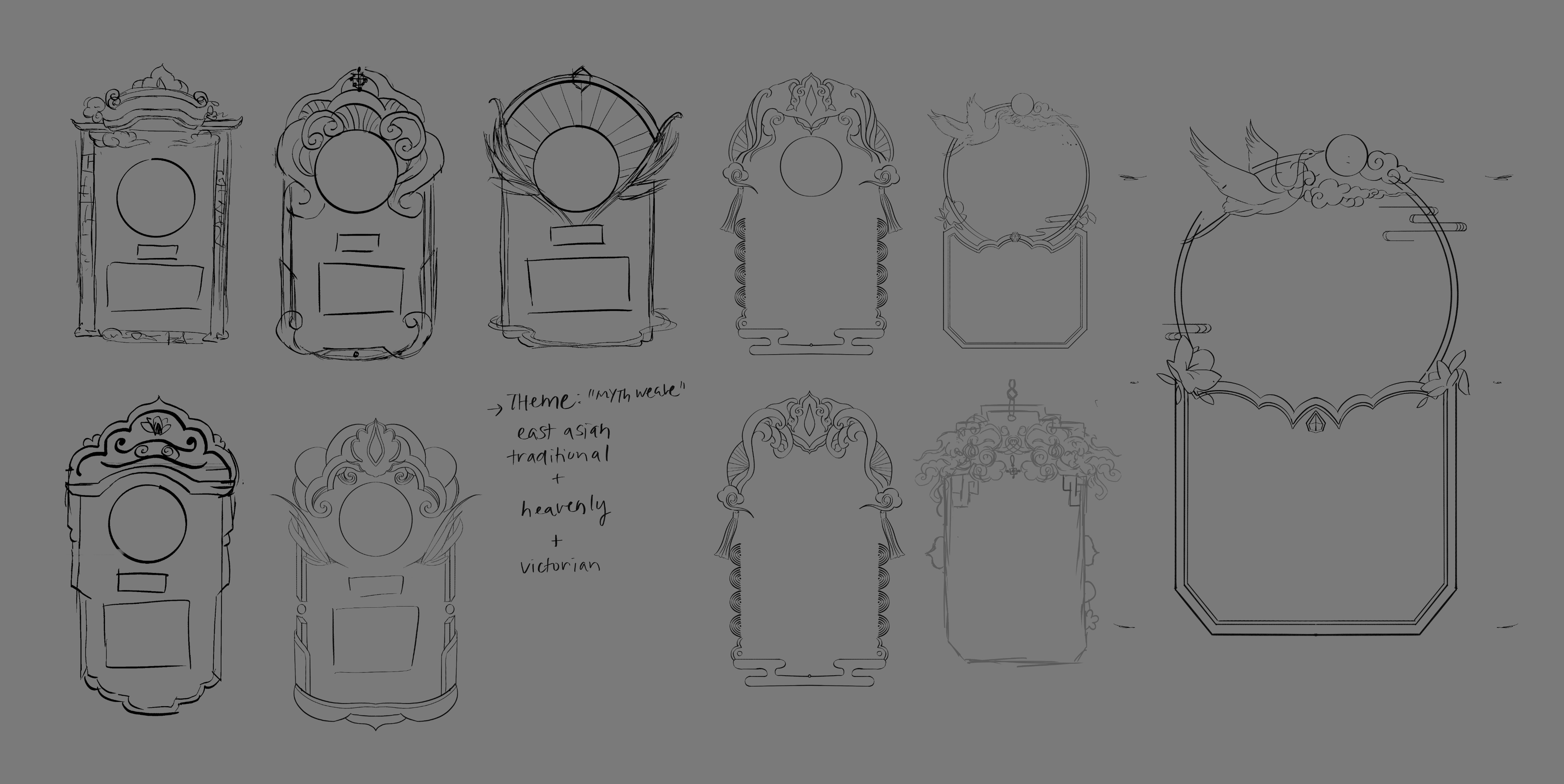
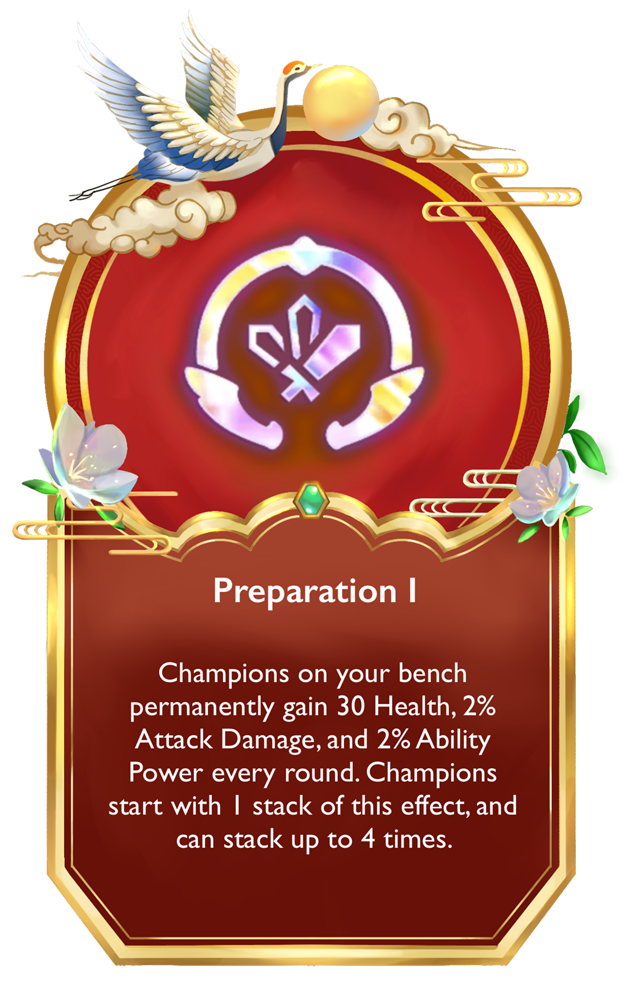
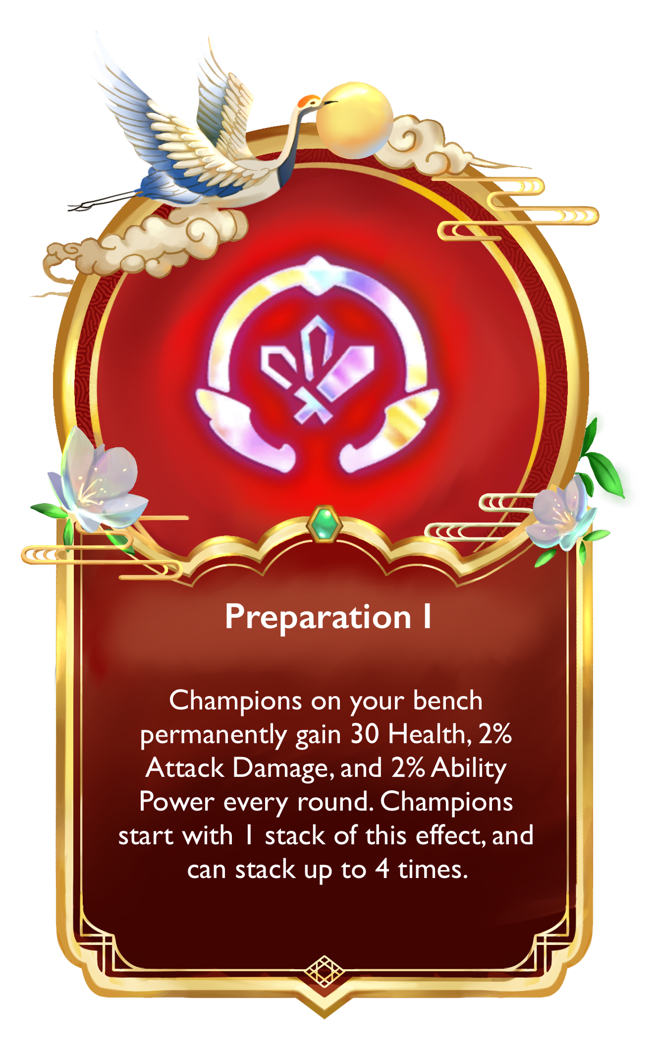
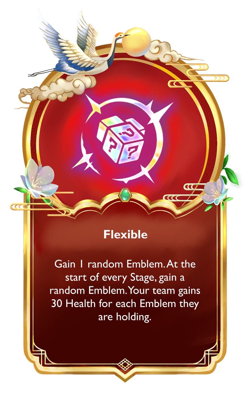
The frame then went through two full digital passes. Between versions, I reworked the border scallop shape, tightened the crane-and-cloud crest, simplified the corner gem, and rebalanced the floral accents so they framed the content without competing with it.
Final Cards
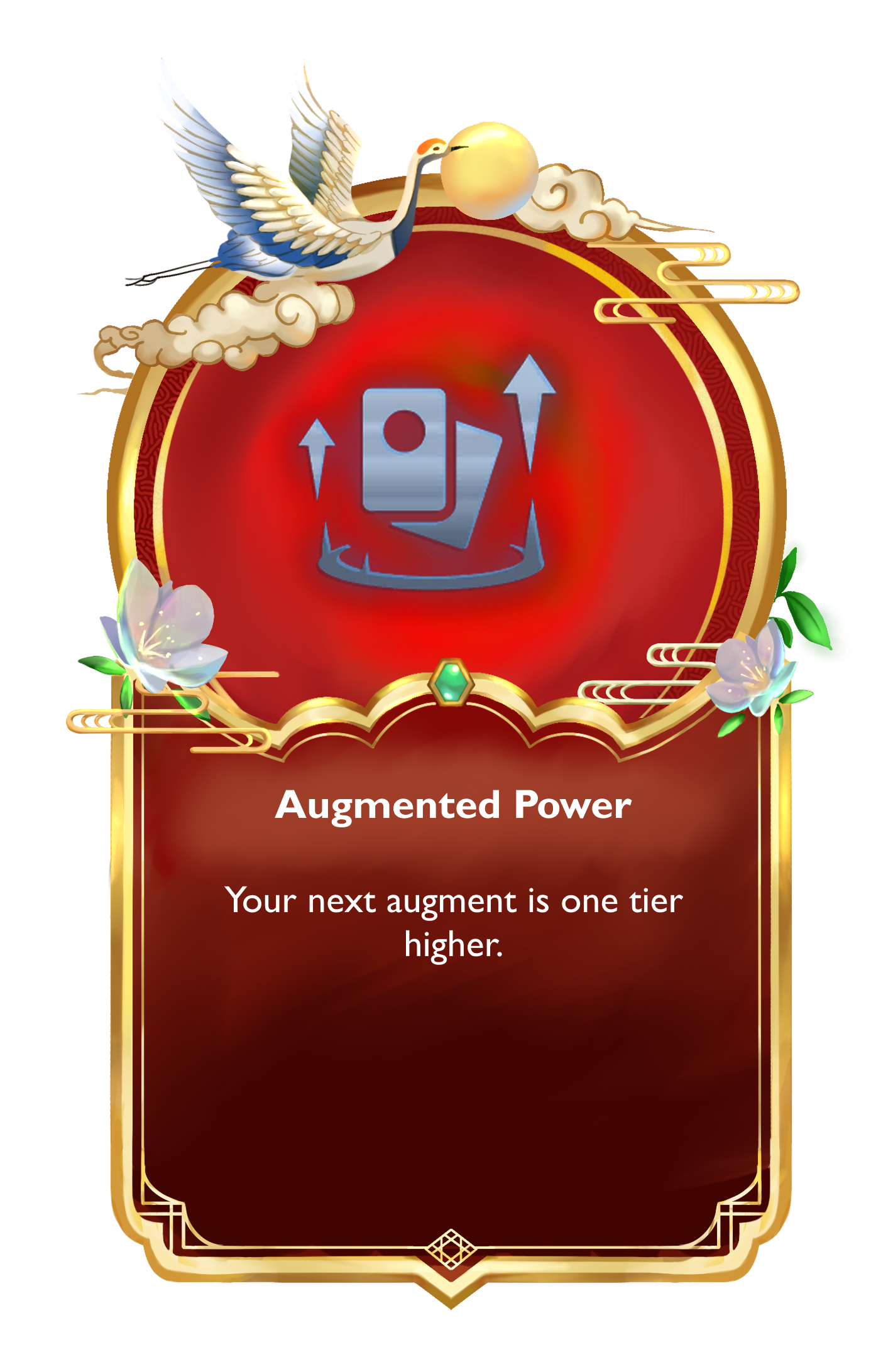
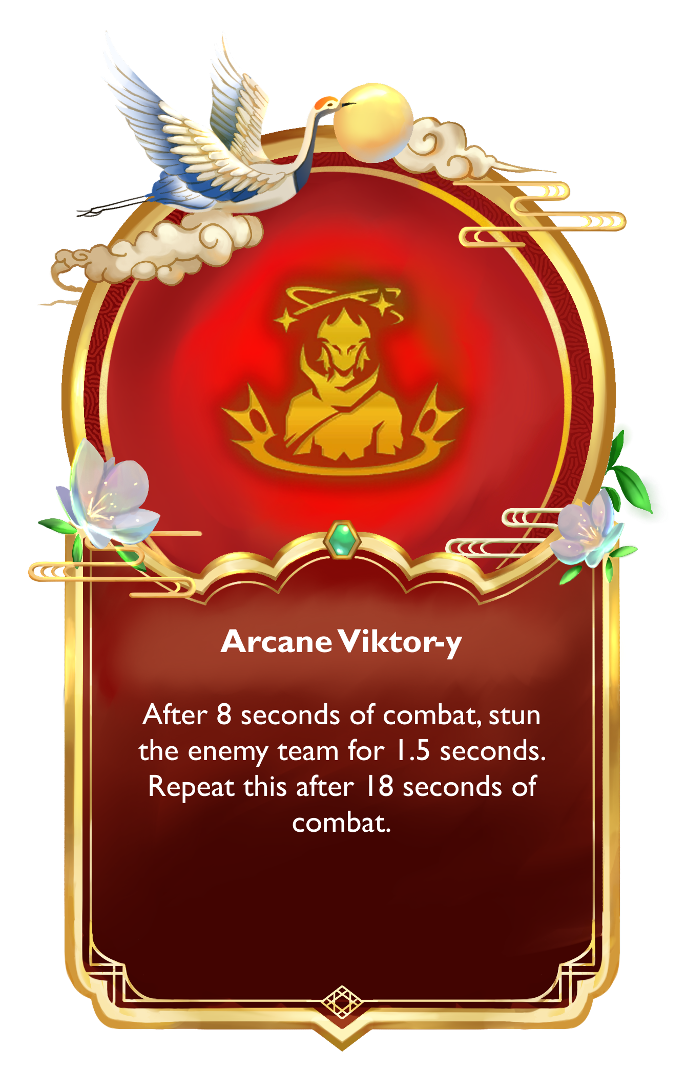
The finished frame applied across augment tiers and content types, each carrying its own icon treatment and color weight while staying unmistakably part of the same set.
Stress Test
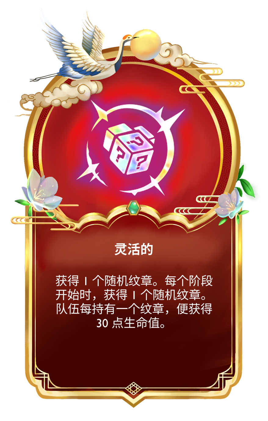
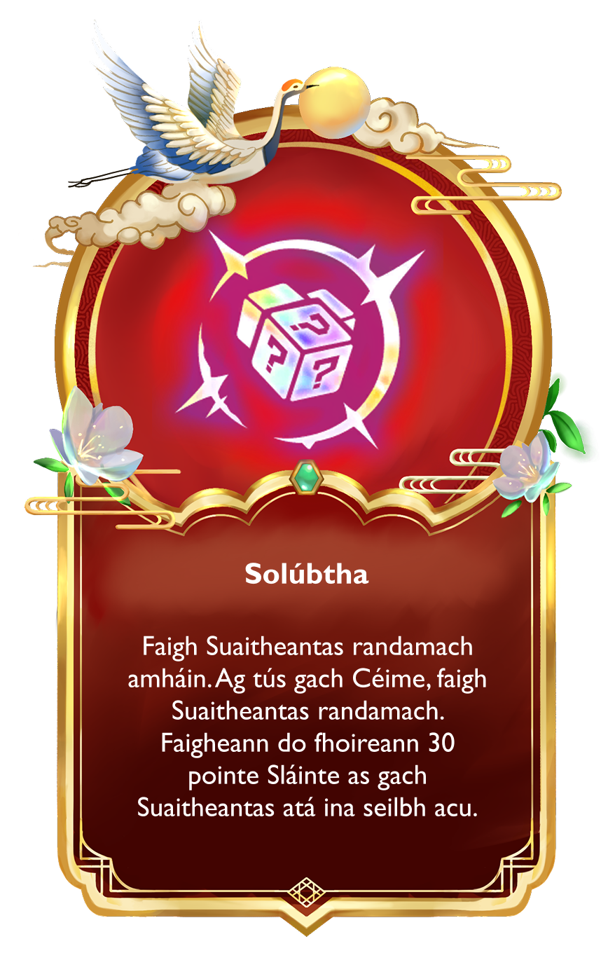
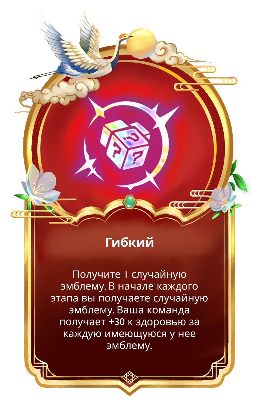
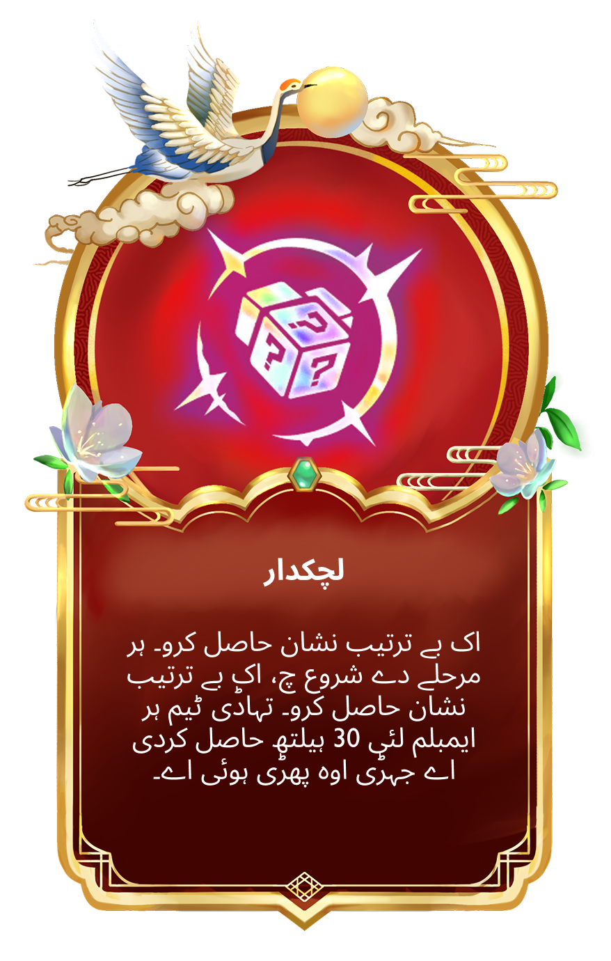
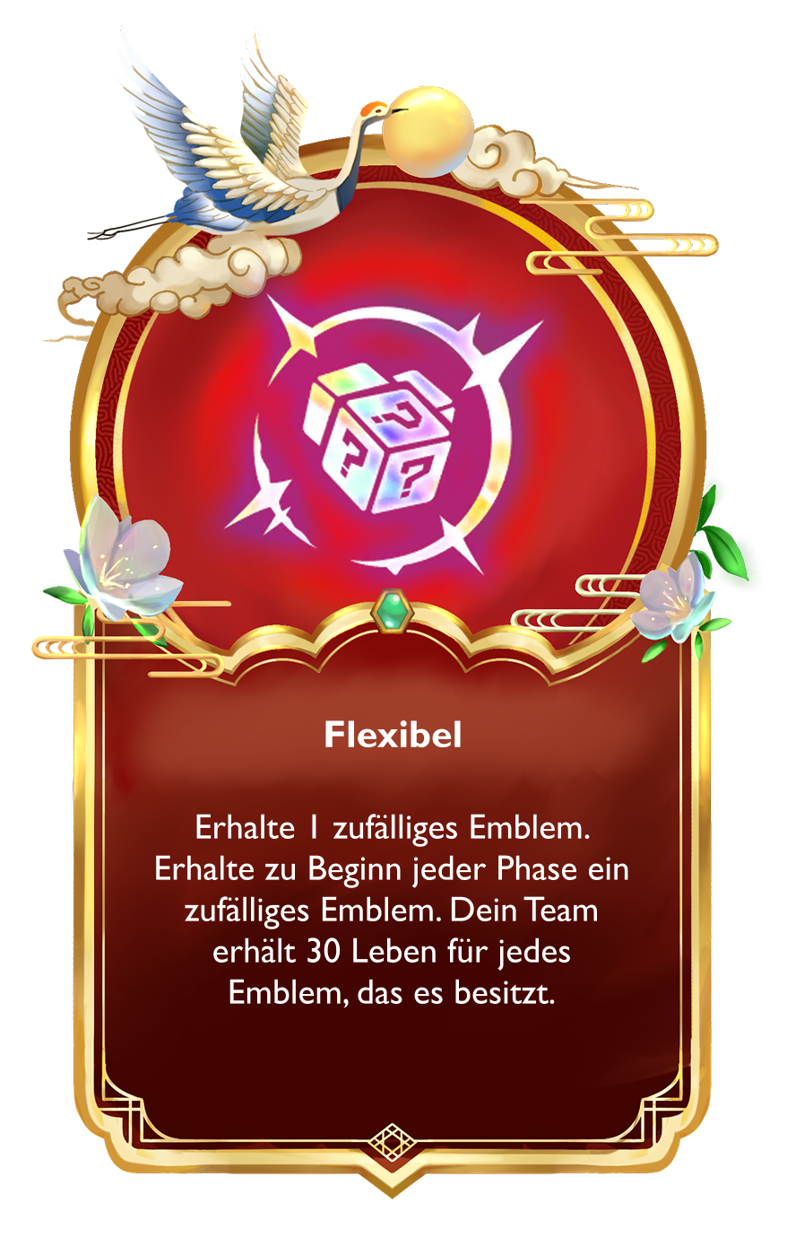
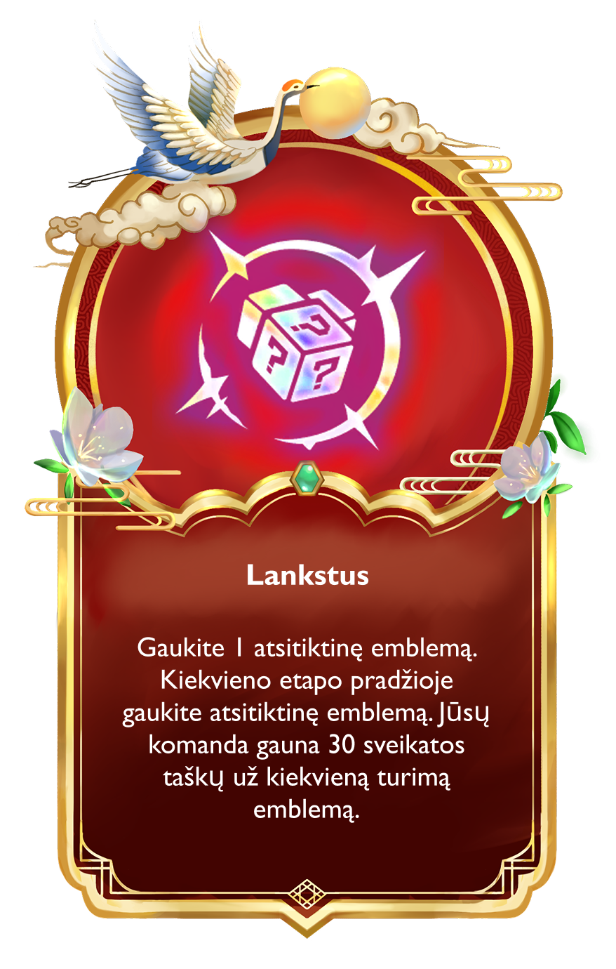
TFT ships in more than a dozen languages, so I checked the frame against real localization strings, not just the English copy. Testing the same augment across English, Chinese, Irish, Russian, Arabic, German, and Lithuanian confirmed the text block could flex to very different line lengths and scripts, including right-to-left text, without breaking the frame’s proportions.
In the Game
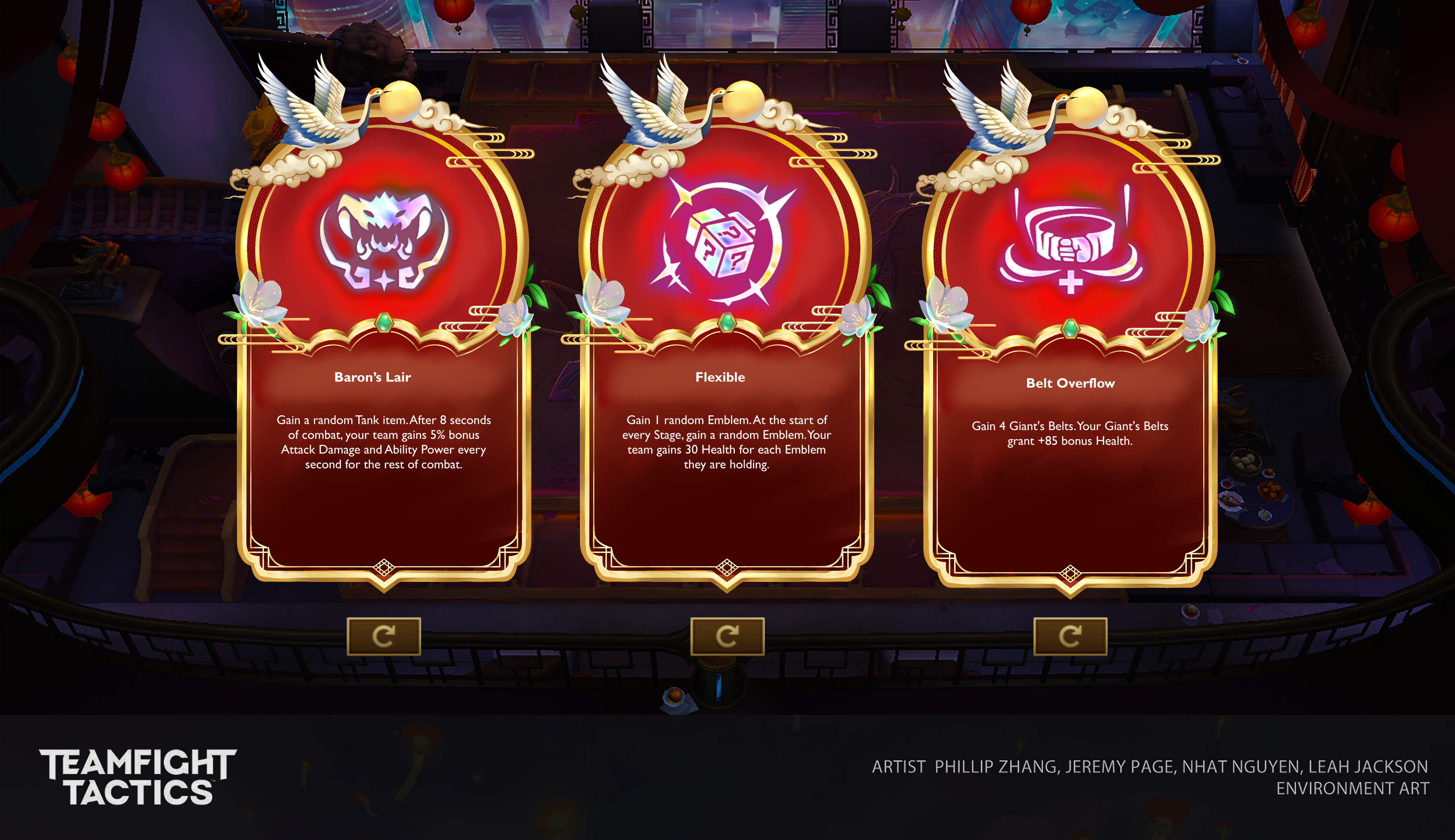
To check how the frame would actually hold up in play, I mocked up the augment choice screen inside a live match environment, checking legibility, color contrast, and scale against real gameplay rather than an isolated card.