Warframe Referral Page
Digital Extremes, 2026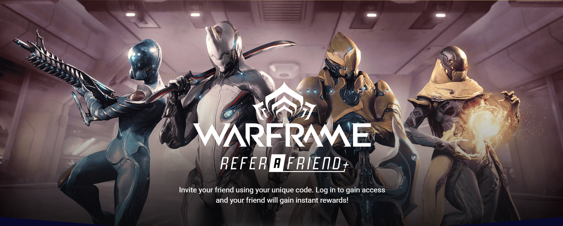
Project Overview
At Digital Extremes, I redesigned the referral program page for Warframe: the flow players use to invite friends and track the rewards they earn for it. The existing page buried the program under generic marketing copy, so most players never found it, let alone used it.
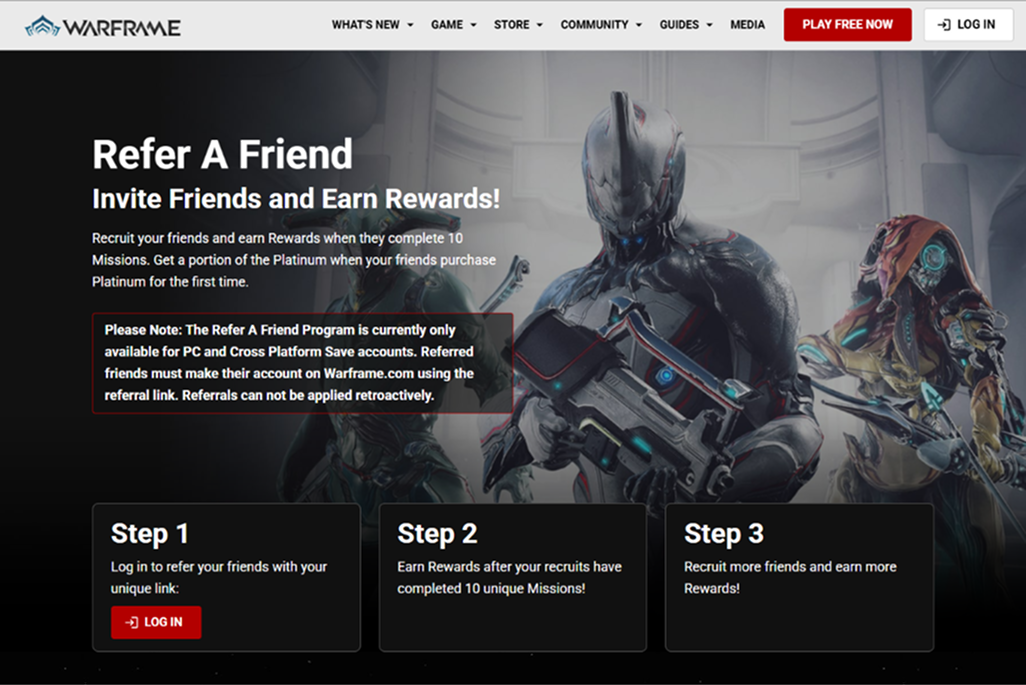
The old referral page read like a marketing landing page: a wall of promotional copy with the actual referral link and reward tiers pushed far down the page. Players couldn’t tell at a glance what they earned, how far along a referred friend was, or what to do next. The program went largely unused despite being one of the game’s strongest growth levers.
How might we turn a page players scroll past into a clear, actionable hub that shows them their referral link, their rewards, and their progress at a glance?
My Role
I was the only designer on this project and owned it end to end: framing the problem, wireframing the flow through four passes, designing the visual system and building it out as components, prototyping the interactions, and carrying it through stakeholder review to the version that shipped on warframe.com.

Designing the Flow
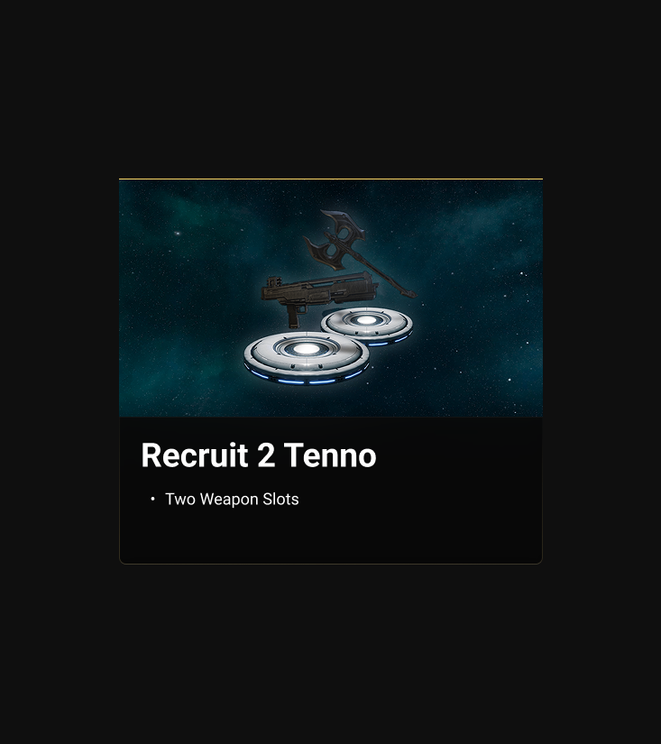
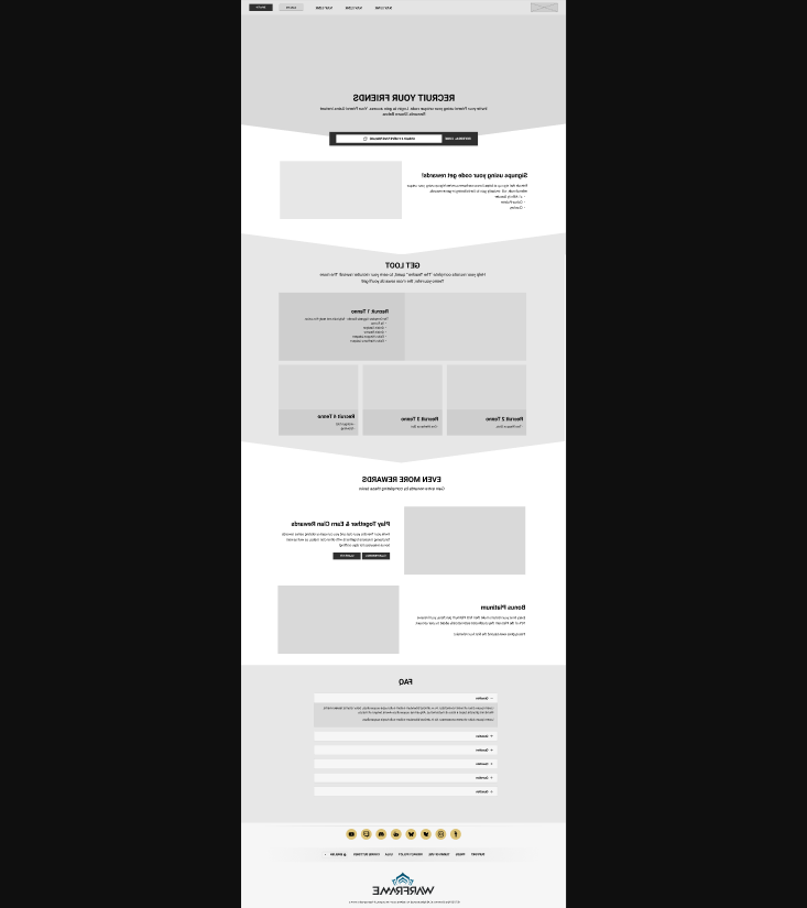
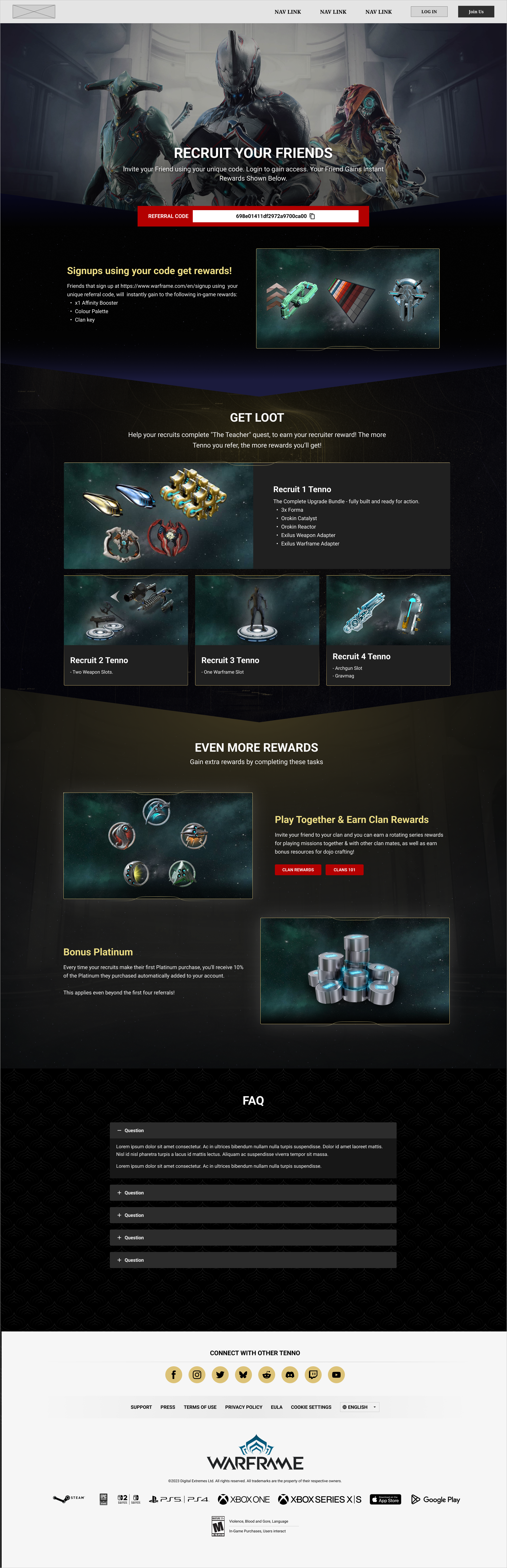
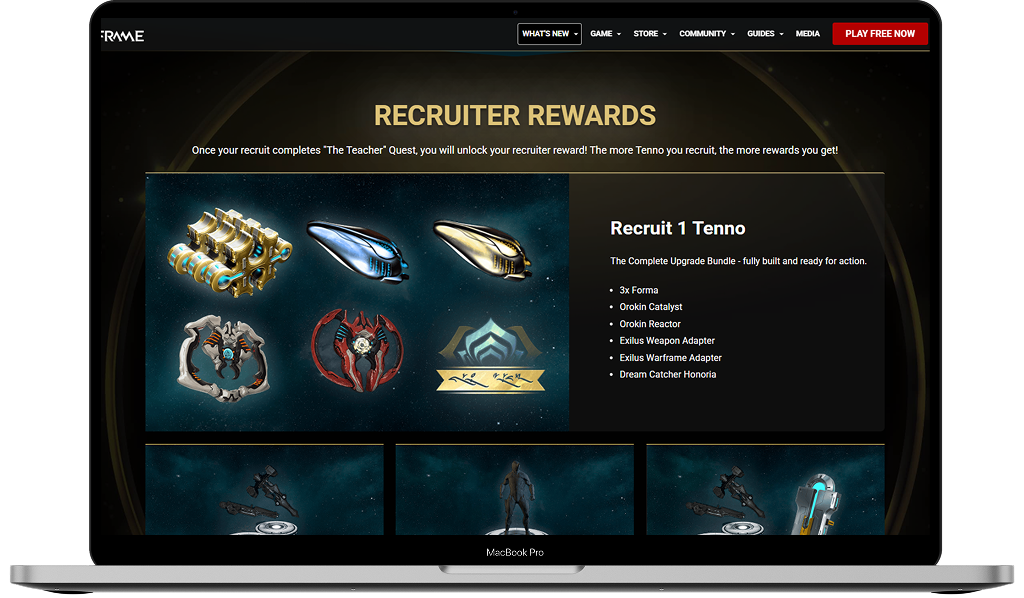
The page went through four wireframe passes. Across them the referral code moved up the page, the reward tiers gained room to say what they actually give, and the marketing copy that had buried the program kept getting cut. By the final pass the tier cards size to their content, so reward copy can change without breaking the layout, and the angled chevron bands carry the game’s motif into the section transitions at the team’s request.
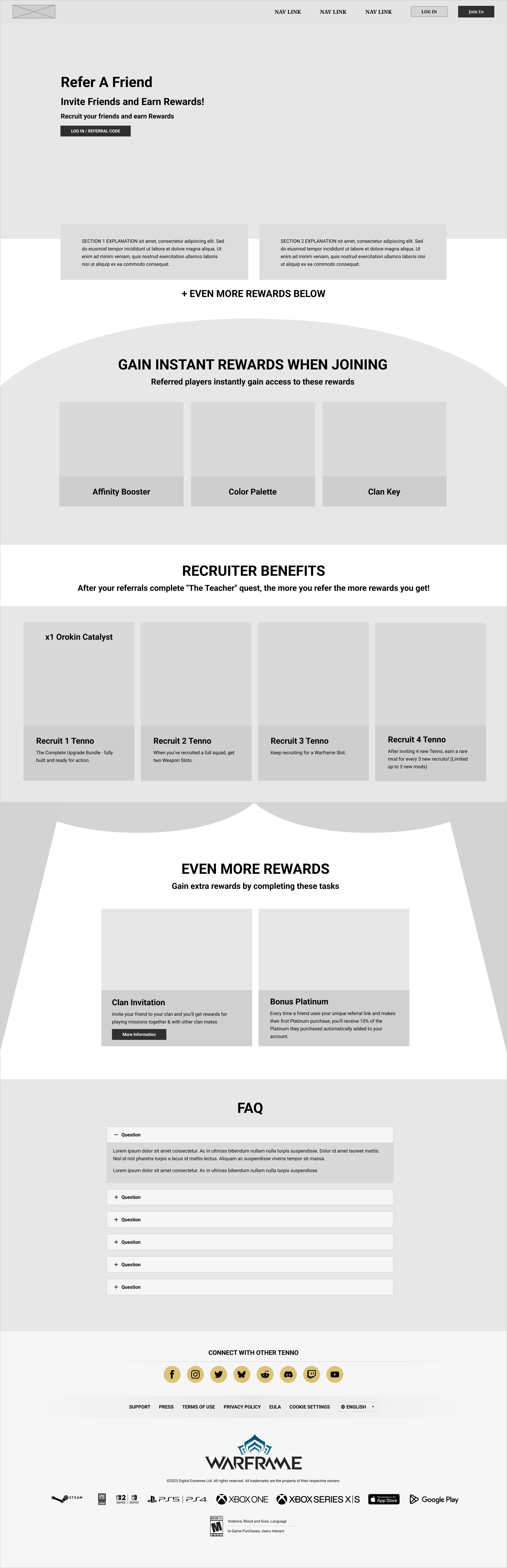
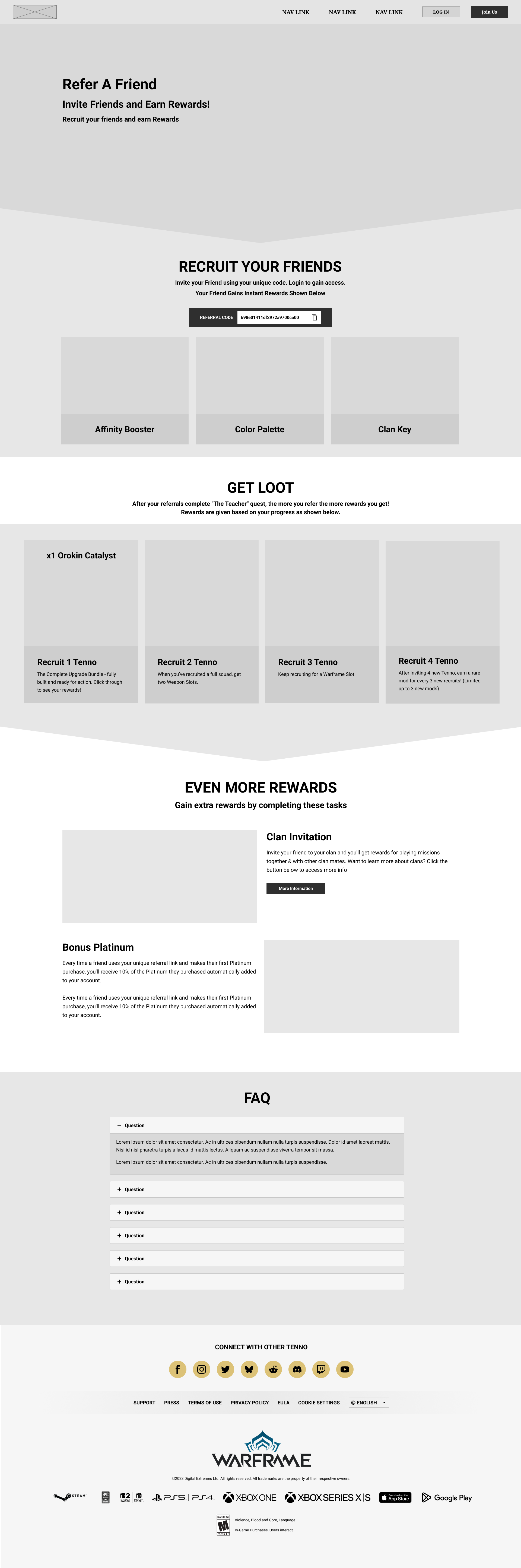
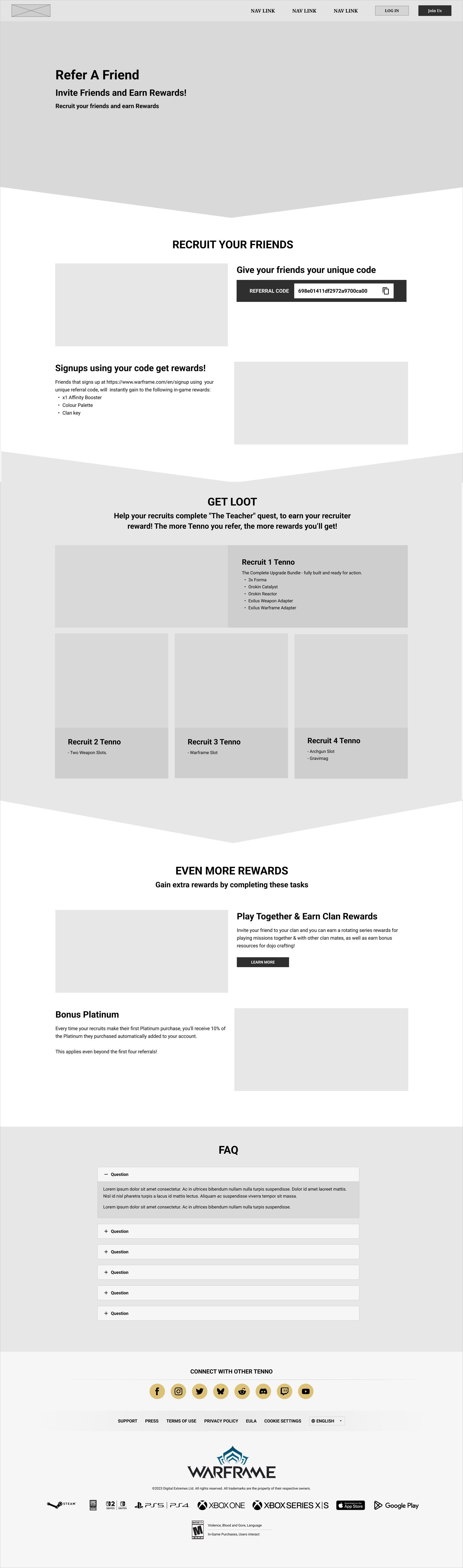
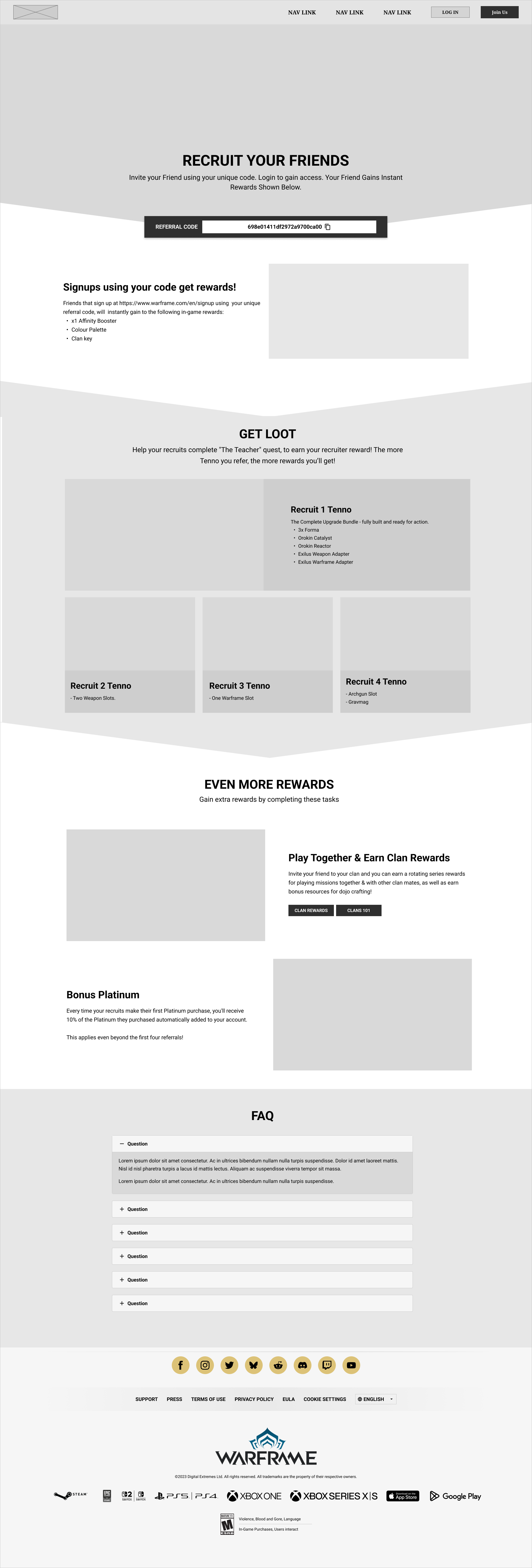
First Visual Pass
The first pass with real assets in. Warframe’s own art and color turned the greyscale structure into something stakeholders could react to, and that is where the substantive feedback came in: which rewards needed more prominence, and how closely the section transitions should echo the in-game UI.
Motion and Components
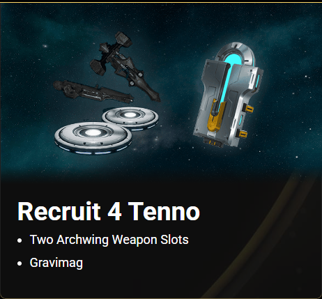
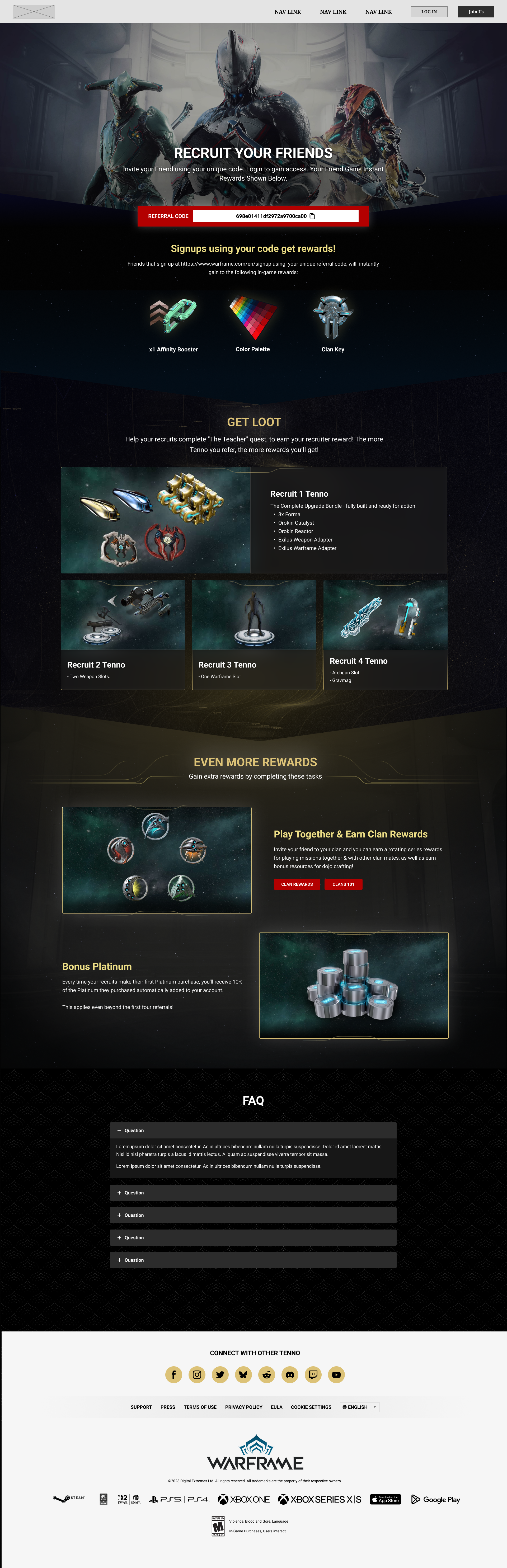
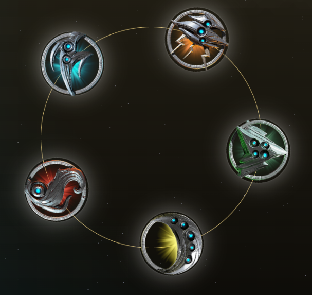
From there I built the page as components rather than flat frames, so the reward tiers, code banner, and section dividers could be restyled in one place. I added motion and prototyped the interactions here, which is where the behaviour in the final design was worked out.
Final Design
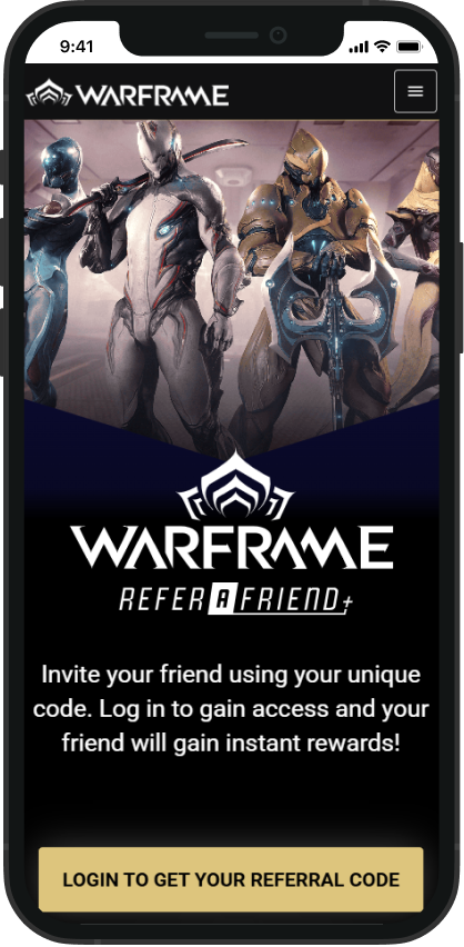
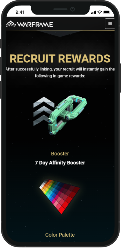
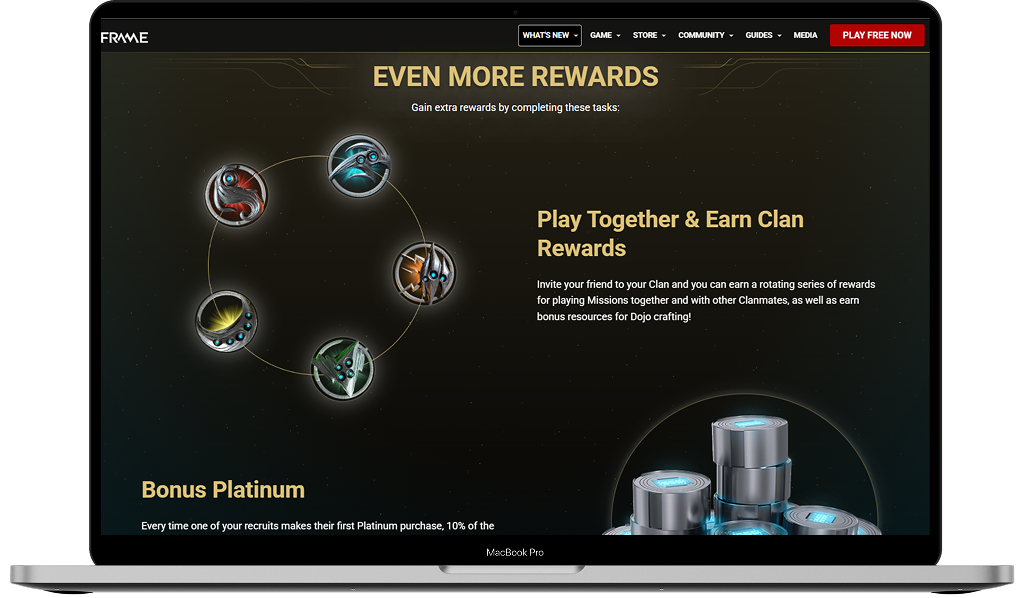
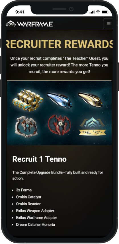
These are the final screens, currently shipped live on the Warframe website. The referral code now sits at the top of the page instead of below a wall of marketing copy, every reward tier states exactly what it gives, and the whole thing holds its hierarchy from desktop down to phone.
View the live page on warframe.com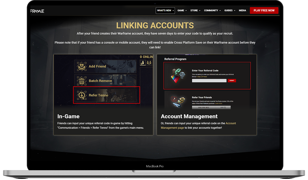
What It Changed
The redesign shipped and replaced the referral page Warframe had been running. What changed is less that the page looks different and more that the program is usable: players can find their code, see what each tier actually gives, and share it from any device.
Shipped
Live on warframe.com as the referral program's page, replacing the one it had been running on.
Findable
The referral code sits under the hero rather than below a wall of marketing copy, so players reach it without hunting.
Maintainable
Reward tiers are components that size to their content, so the team can reword or add rewards without a redesign.